Senior Interaction Designer · Intuit
2011–2012
Websites First Time Use.
Improving the Intuit Websites onboarding experience
User problem and why it mattered
How might we make it easier for small-business owners to build a website for the first time, so more can move from signup toward a finished site and support the goal of doubling conversion?
Impact
- The winning marketing-page treatment increased price per user by $2.30 per month and monthly recurring revenue by $363 over control.
- Flow tests revealed that users’ understanding of the product needed more attention than flow changes alone could address.
My contribution
- Product/UX design: interaction and visual design
- A/B testing and experimentation: marketing-page and in-market tests
- UX research: user sessions and research synthesis
- Prototyping: front-end research prototypes
Timing
- Project period
- 2011–2012
First time use
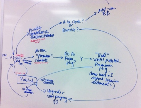
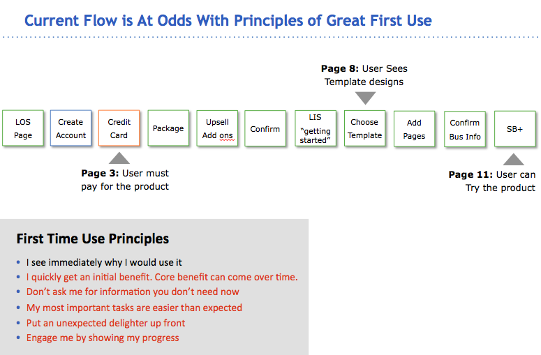
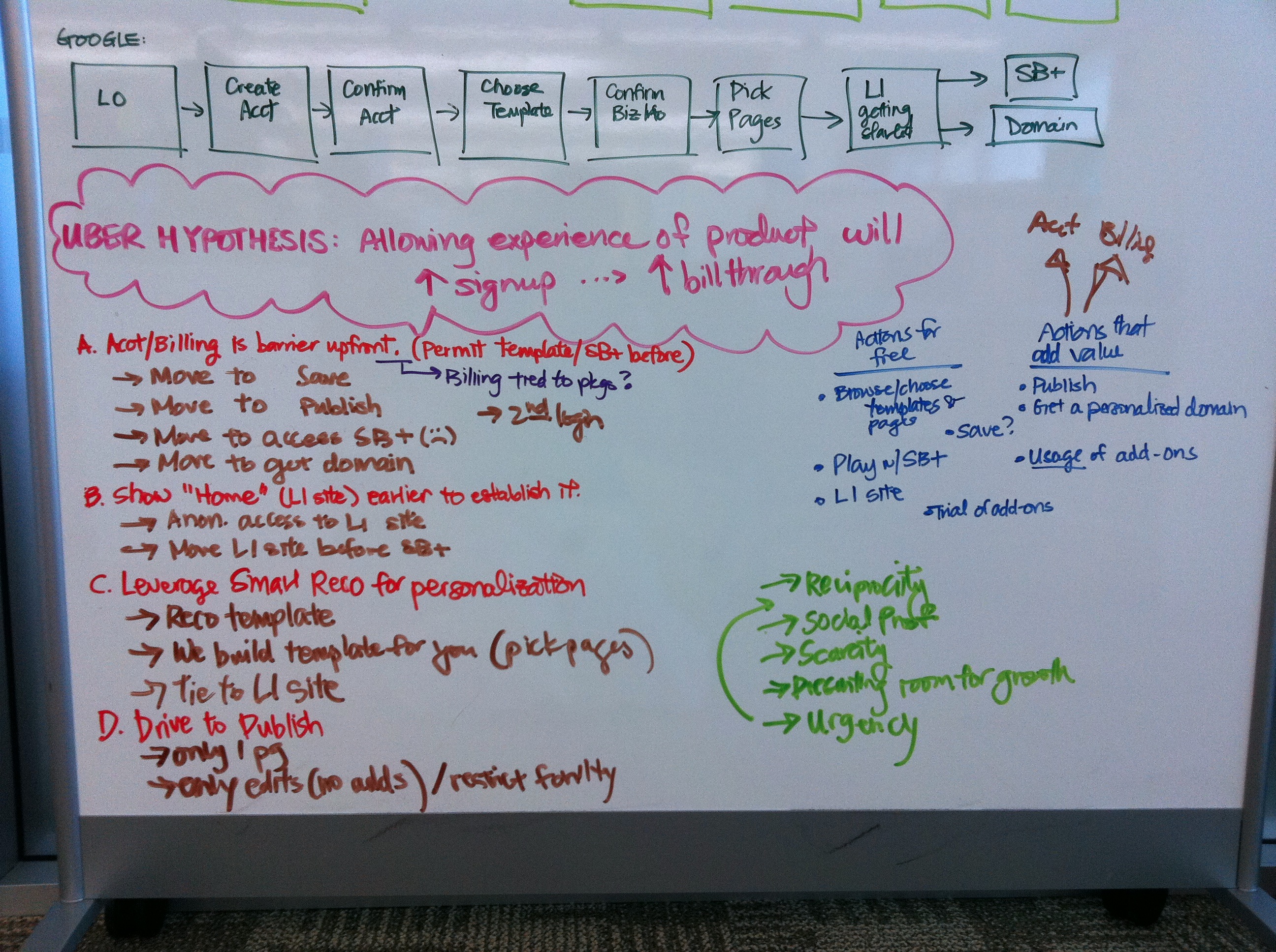
Intuit Websites needed to help more small-business owners move from signup toward a finished site. The team set a goal of doubling signup-to-conversion. I started by examining the existing flow and Intuit’s first-time-use principles to see where new customers might need more guidance.
Early thinking
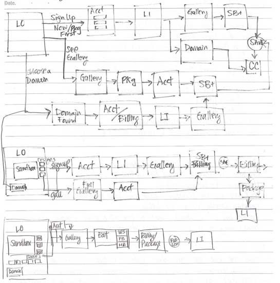
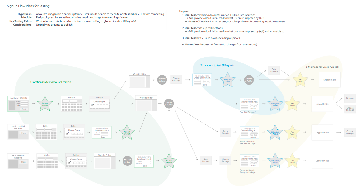
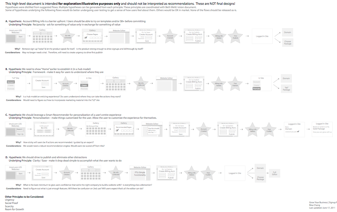
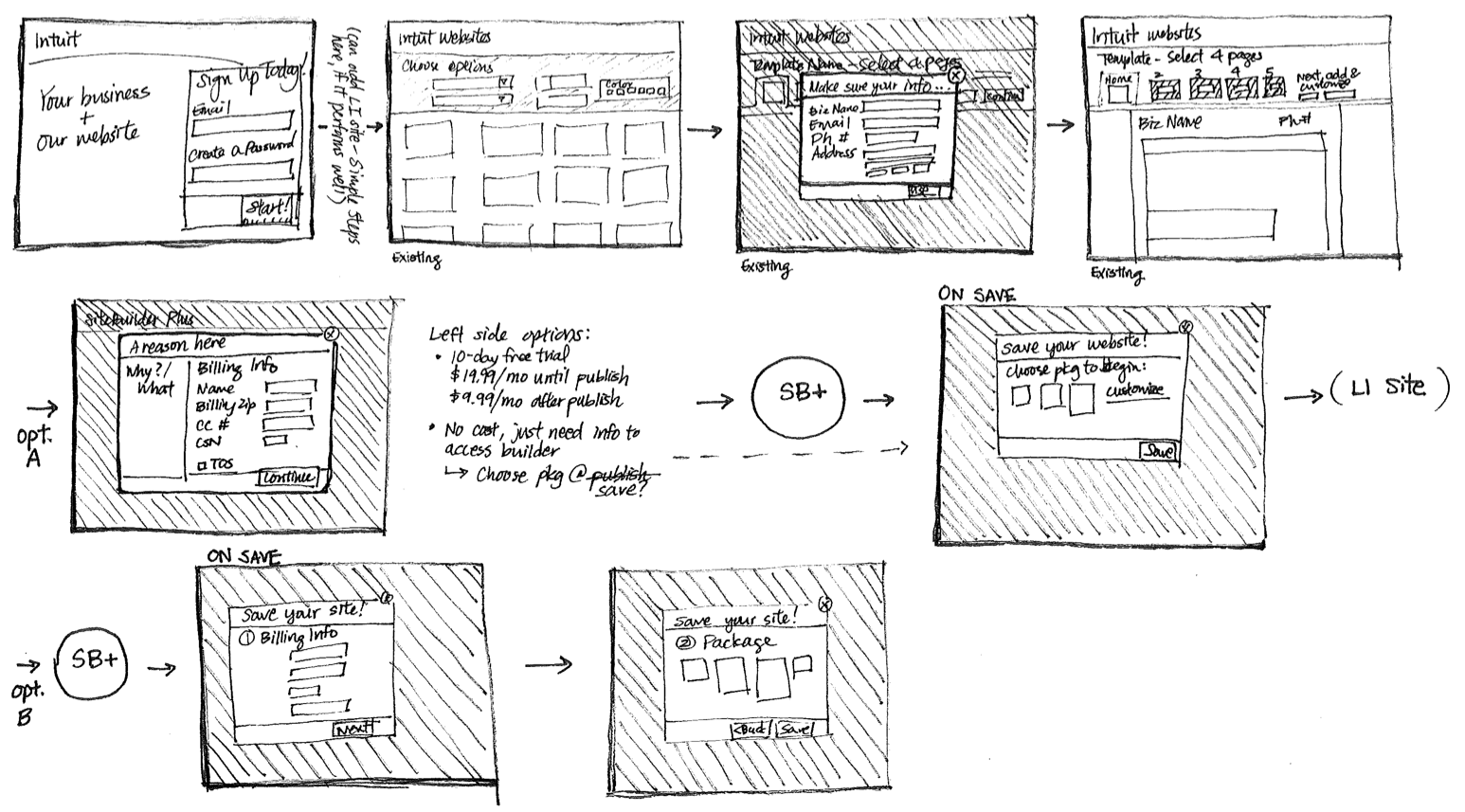
From that starting point, I explored several ways the first-use flow could work. I used sketches, flow diagrams, and a design-principles workshop to compare approaches, then narrowed the work to a direction we could test with users.
User research
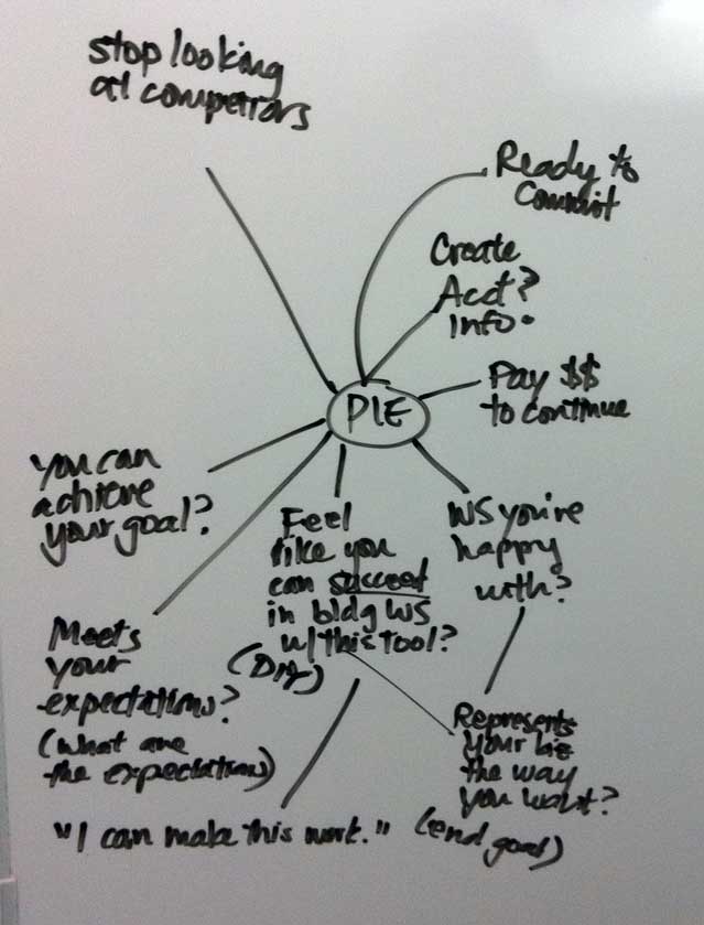
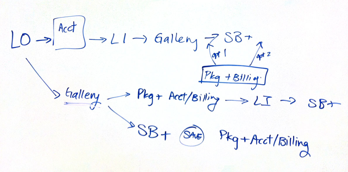
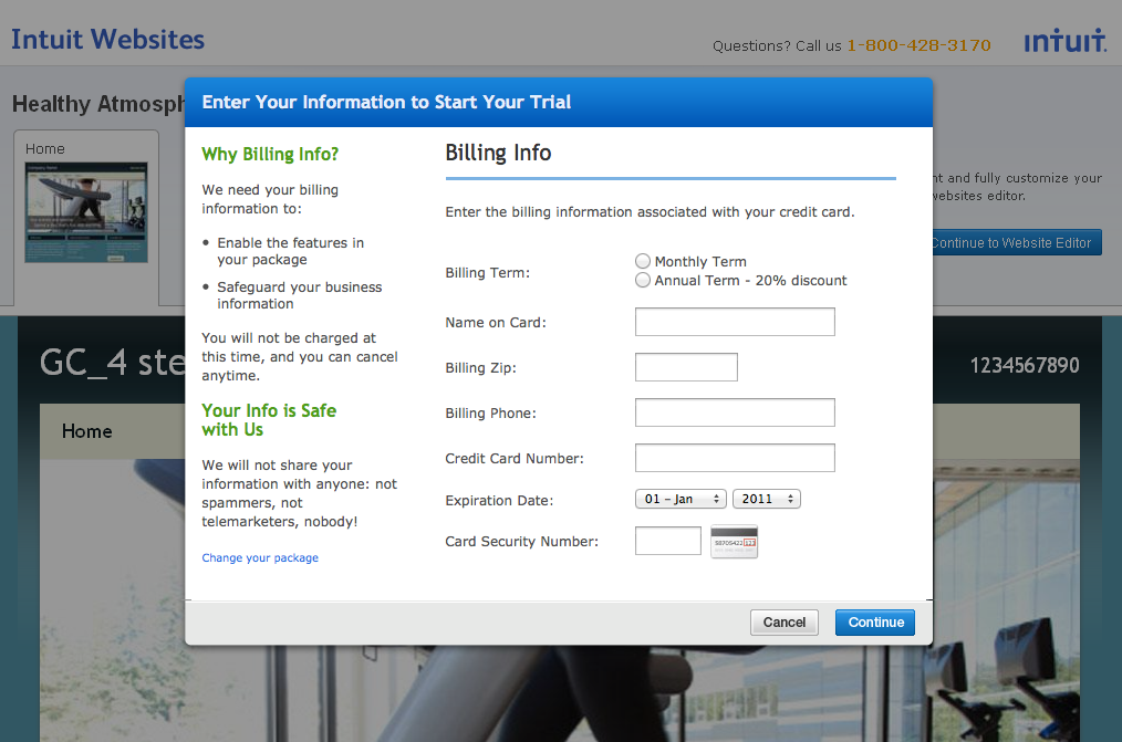
Next, I turned those ideas into research materials. I mapped what new users might want to know during first time use, wrote screeners, built clickable prototypes, and moderated sessions to see how people responded to the proposed flows.
I synthesized what we learned and shared the findings with leadership and the broader team, using the research to weigh the design choices in front of us.
Marketing page exploration
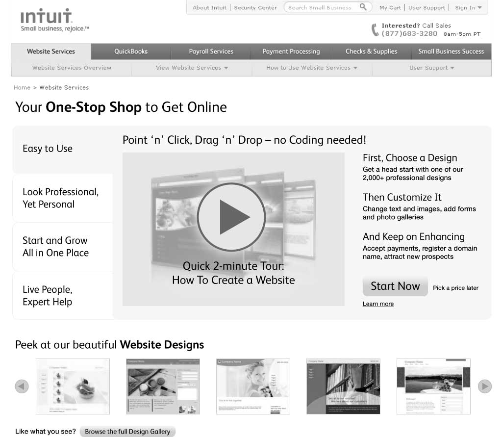
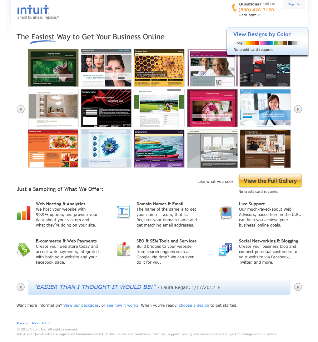
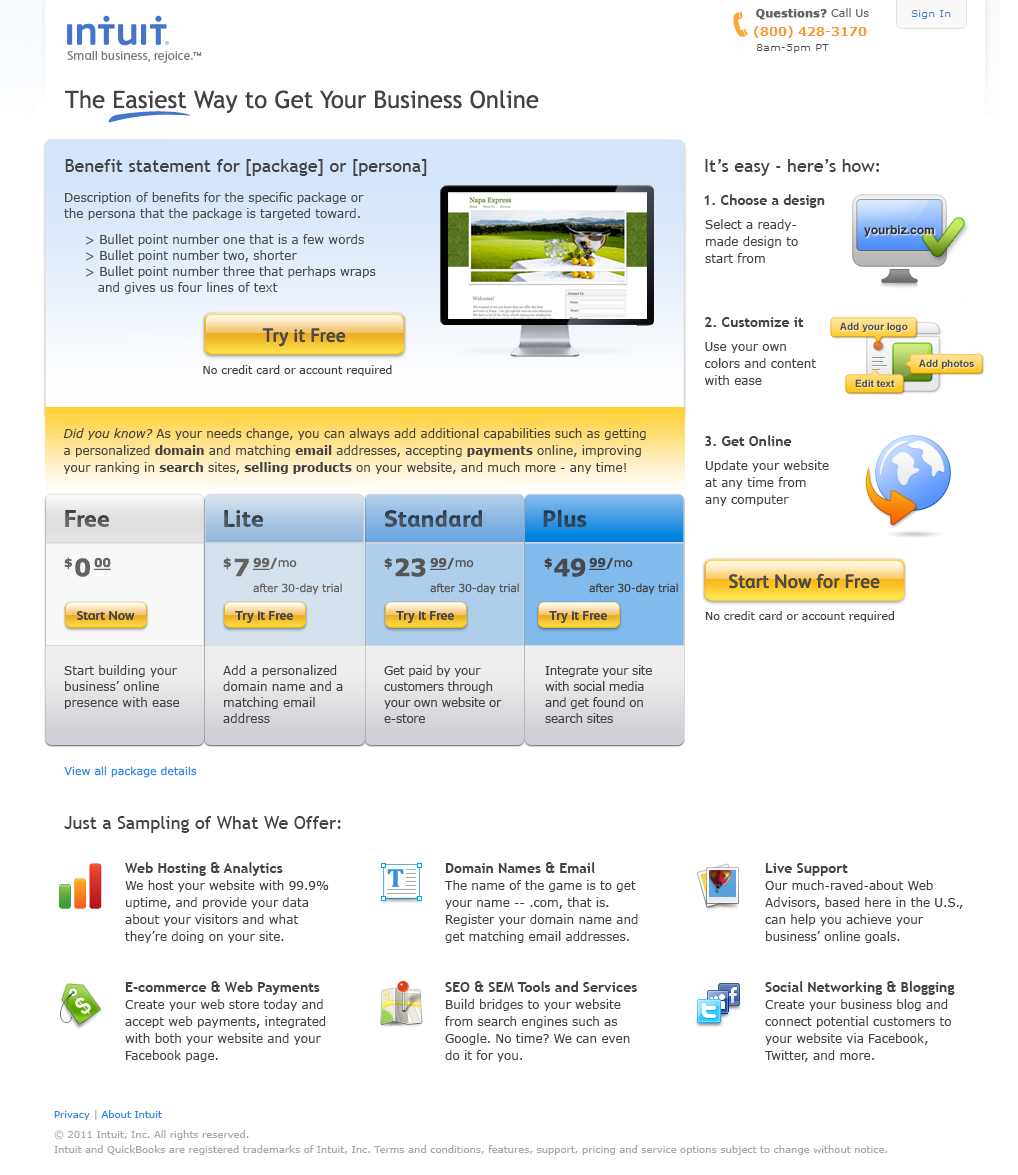
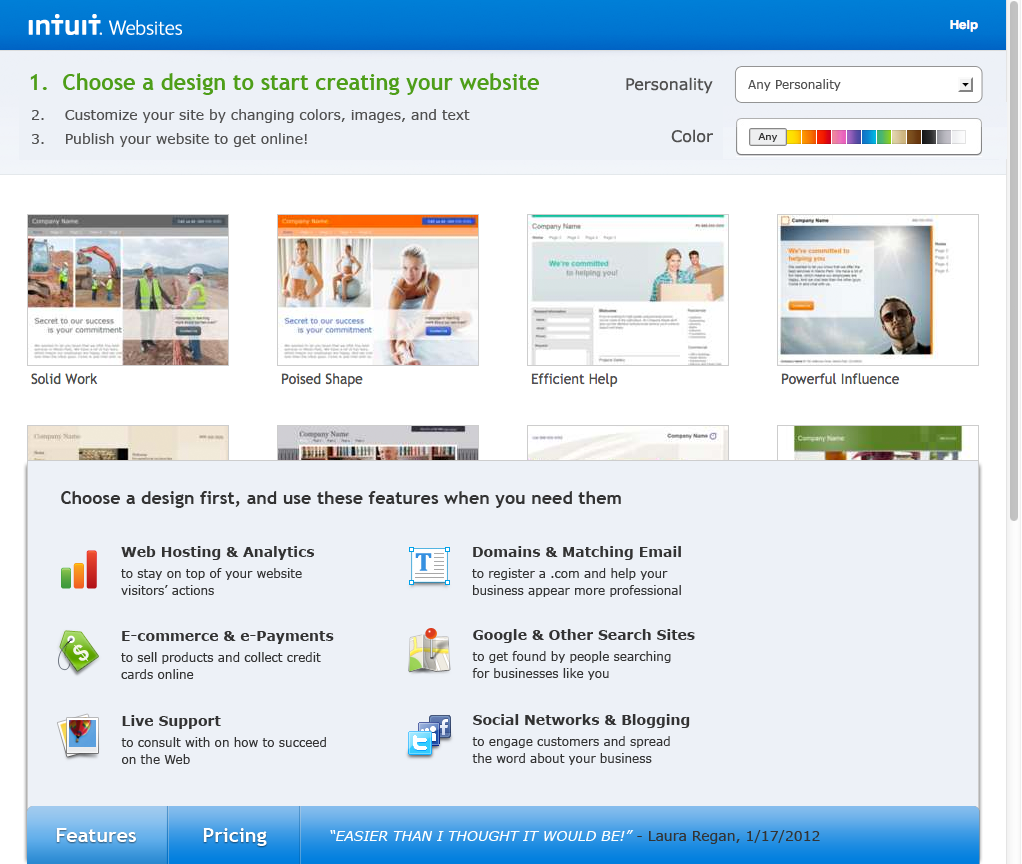
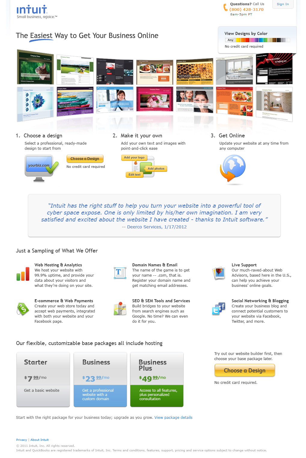
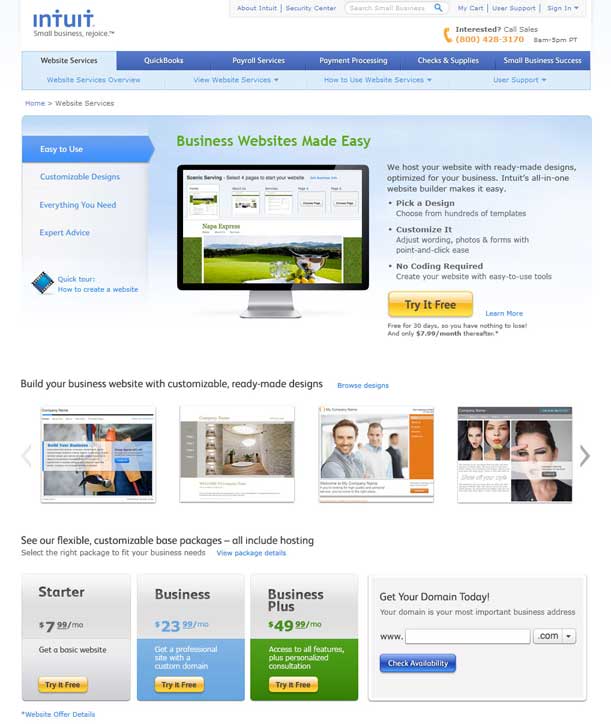
From the user research, we identified a larger problem with the long-standing marketing page that introduced Intuit Websites before signup. I shifted focus to that page and explored six directions for presenting the product, from a wireframe and interactive gallery to static galleries and an approach inspired by TurboTax. The exploration led to an in-market test, then I returned to the signup flow.
Six variations explored
I explored six marketing-page approaches, including a wireframe for user testing, interactive and static galleries, a customer quote, a TurboTax-inspired direction, and a version emphasizing ease of use. The gallery below shows the range of concepts before the in-market test.

Testing and outcome
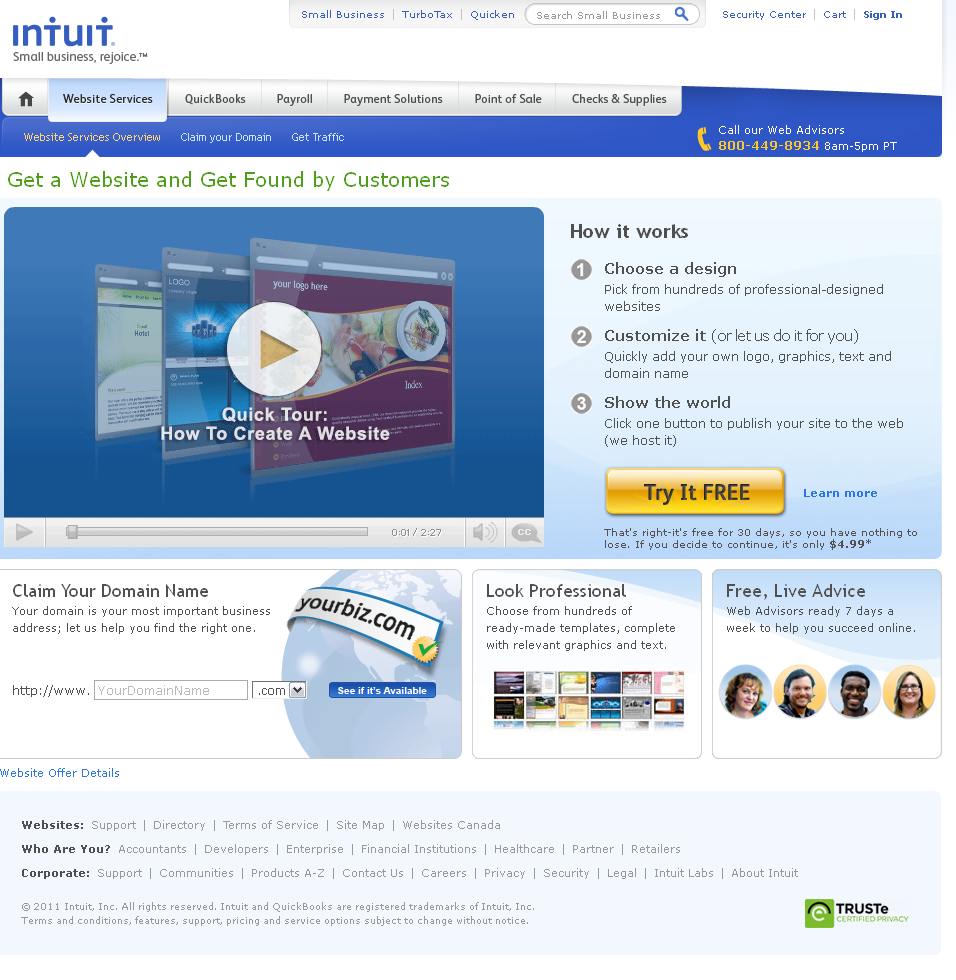
From the marketing-page exploration, I designed multiple variations and launched an in-market test. The winning treatment of the four-cell test increased price per user by $2.30 per month and monthly recurring revenue by $363 over control.
Signup flow iterations
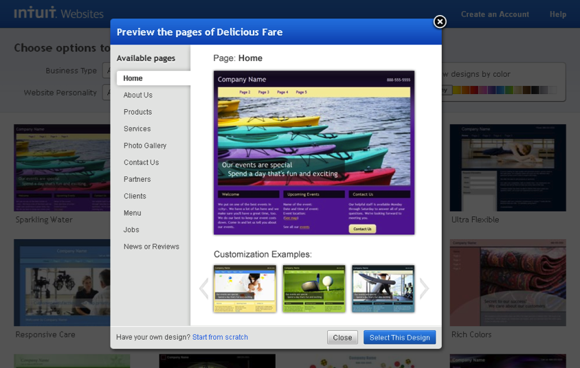
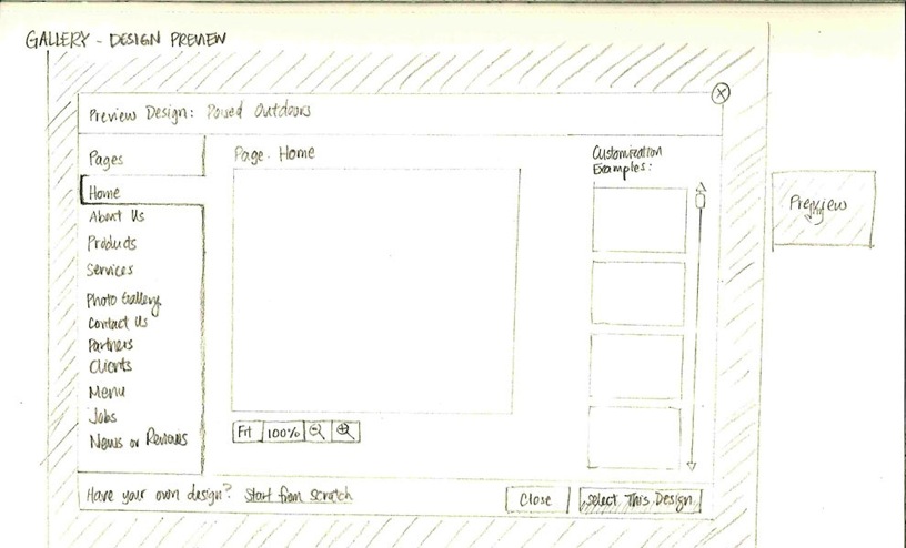
After the marketing-page test, I returned to the first-time-use flow. I used the research findings to develop sketches, wireframes, and screens for signup and design selection.
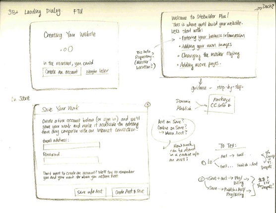
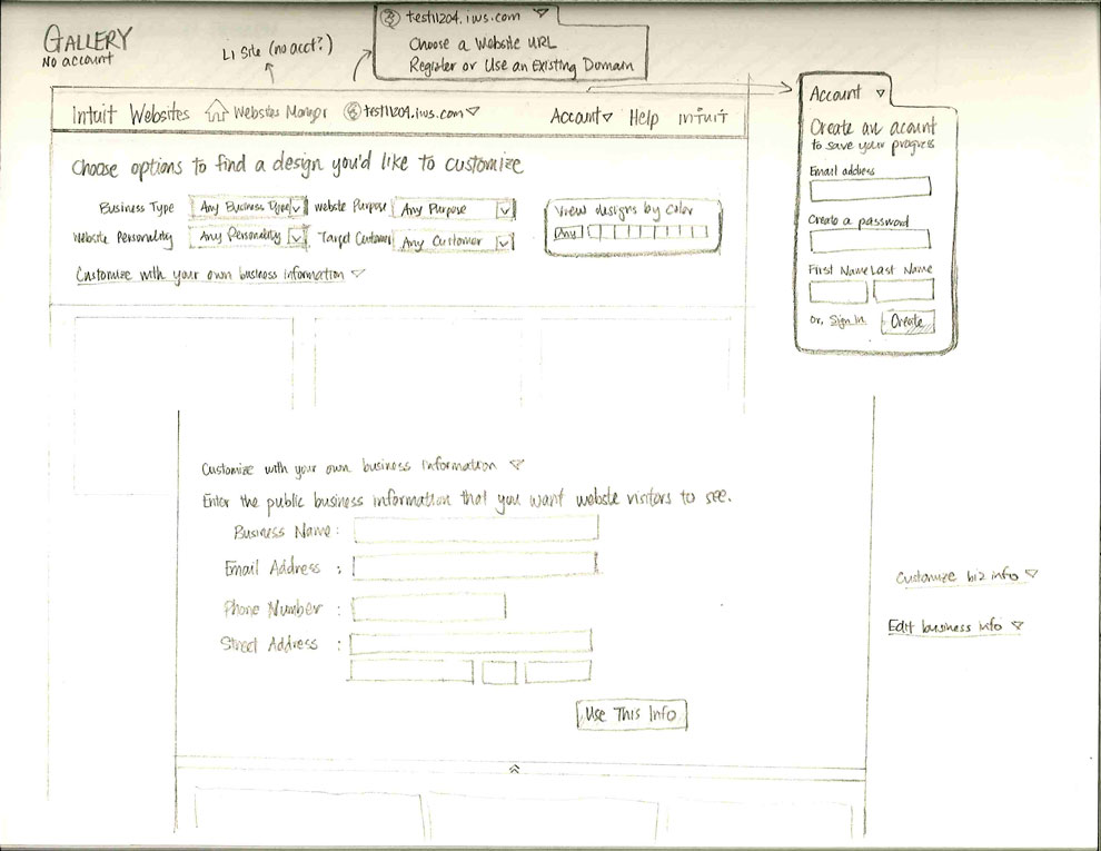
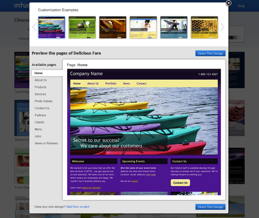
In-market flow tests
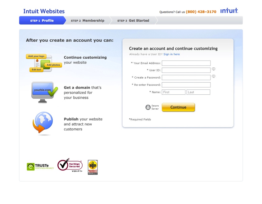
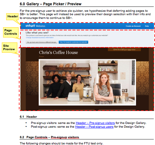
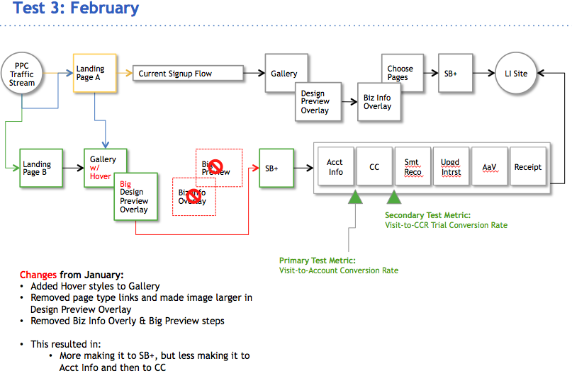
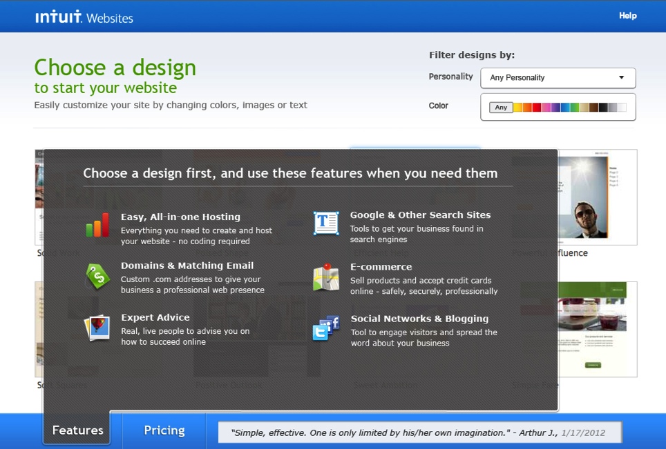
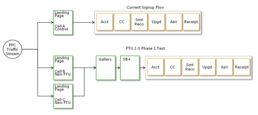
I then worked with a product-management partner on four sequential in-market flow tests. Each test built on our analysis of the previous one. I designed the screens, wrote specifications, and worked closely with the cross-functional team to implement the changes.
Test results
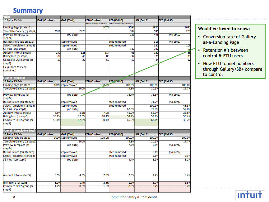
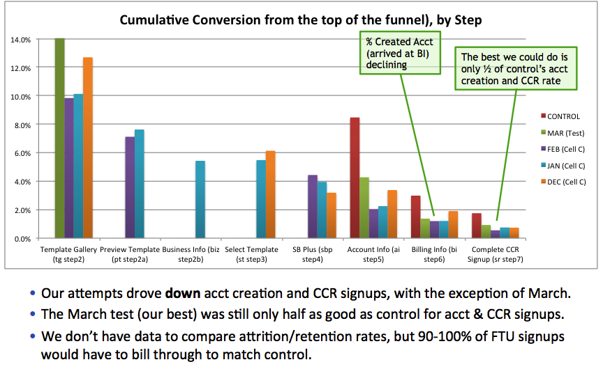
The tests showed that changing the flow alone would not resolve the larger issues with users’ understanding of the product. I analyzed the results across the test series, explained where our hypotheses had not held up, and presented recommendations to leadership and the broader team.
Outcome
The work produced a measurable improvement in the marketing page: the winning treatment increased price per user by $2.30 per month and monthly recurring revenue by $363 over control. But the flow tests also showed the limits of rearranging signup steps. Users’ understanding of the product needed more attention than flow changes alone could address. I brought those findings and recommendations back to leadership and the broader team to inform what we should tackle next.